Bas-relief Text. Consider Details to Create Perfect Images
When you create 3D looking images, you step into the sphere of 3D modelling. To make your work look more realistic, think of how objects look in the real world.
Use Appropriate Fonts
Look at this picture (how to create it is described in Creating Bas-relief Text in Art Text).
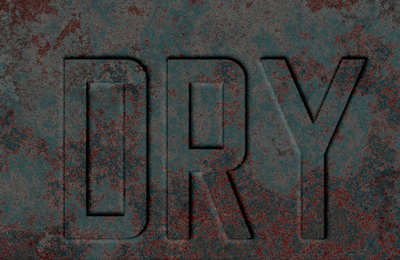
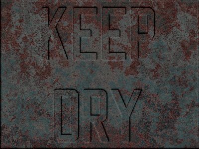
Do you often see inscriptions on the stone made with a font like Times? Letters engraved on marble or granite, or depressed on metal usually have a simpler shape like in the "KEEP DRY" example.
Old-style fonts also look nice with stone textures:
Imagine How a Real Object Was Created
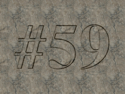
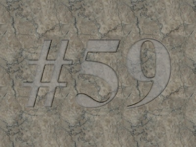
Try to understand what way a real object you mimic has been manufactured. For example, when letters are engraved on a polished stone, the bottom of the letters usually remains matte. You cannot perfectly see the texture of marble or granite inside letters as in the picture "#59". So, this picture looks a bit more realistic:
Don't Overdo Sheens
With no texture, your object may look like it is plastic.
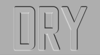
Now let's return to the "KEEP DRY" example. What's wrong?
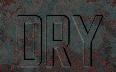
A texture suggests us an idea that we see rusty metal and old paint. Reflections along the edges of letters are too bright. To fix this in the "KEEP DRY" document, choose or create a material that has less difference between the darkest and lightest colors. Compare the Dark Gray and Gray materials:


With Gray, the picture looks better: